 In
preparation for the "Goldfinger" sequence
In
preparation for the "Goldfinger" sequenceWatching Words Move
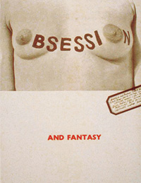
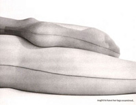
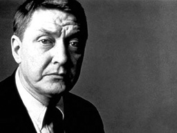
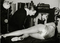
ROBERT BROWNJOHN aka BJ [*1925 - +1970] one of the most influential graphic designers of the 20th century, gained international cult status with his specific use of sexually appealing typography; Some representative samples of his approach include the design of the title sequence for "Goldfinger" and "From Russia with Love", as well as the the "LIFELON" advertising campaign for nylon stockings - all characterized by a strong emphasis on sex resp. the female body. As described by himself - this unique integration of sex, typography and meaning would enhance the simultaneous experiene of 'seeing and reading' at once... :
 |
 |
 |
Brownjohn died of a heart attack at the age of only 45, most probably as a consequence of his 'lifelon' drug addiction, while the most sexy title design of all, exceeding even the masterworks of Maurice Binder and Saul Bass, has not been excelled yet, so far.. *
"For the average audience, the credits tell them there is only 3 minutes left to eat popcorn. I try to do more than simply get rid of names that filmgoers are interested in. It is just like a super book-jacket." - Words by Saul Bass, who was considered the uncrowned king of the credit-title designers before BJ came up with his sexy stuff. **
* At the most, imitated in a dull manner e.g. 'CATCH ME IF YOU CAN'
** Extracts and images from http://www.designboom.com/brownjohn.html